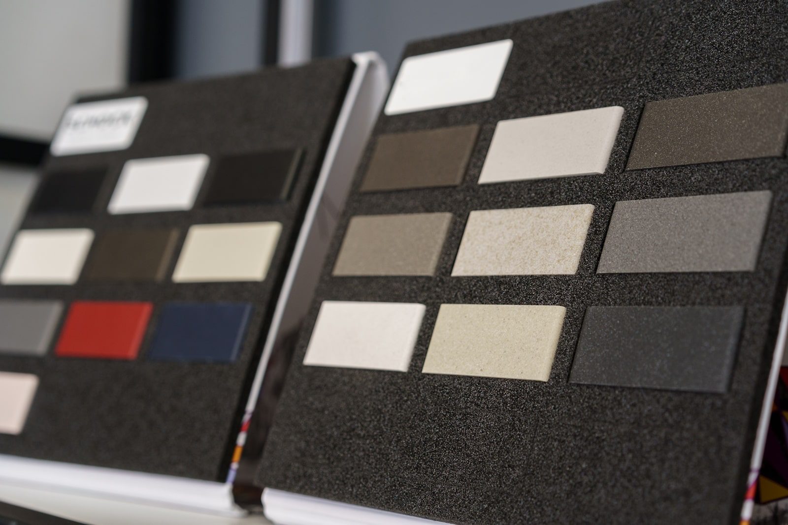
Interior Design for a Company: Industry-Specific Colour Palettes
In the world of interior design for a company, colour isn’t just decoration—it’s a strategic communication tool. The palette you choose can significantly influence how your brand is perceived, how your employees feel, and how clients engage with your business. While all professional spaces benefit from thoughtful design, the ideal colour scheme varies widely across sectors. Each industry brings a distinct ethos, and colour palettes are a powerful way of expressing it.
This article explores how law firms, tech start-ups, and creative agencies use colour to shape environments that reflect their values, culture, and commercial identity. Understanding these distinctions is essential for any business seeking to create an office space that goes beyond aesthetics and genuinely supports its brand mission.
Law Firms: Establishing Authority and Credibility
In the legal industry, trust, formality and discretion are paramount. The interior design for a company operating in this space needs to reflect those core values. Clients often visit law firms under stress, seeking clarity, stability, and professionalism. Neutral, conservative palettes are crucial in reassuring them and projecting competence.
Palette Focus: Neutral, muted, and conservative tones
Why: Projects professionalism, trust, and stability
Common Colours:
- Navy Blue: Associated with authority, confidence, and dependability
- Charcoal Grey: Communicates maturity, neutrality, and balance
- Deep Forest Green: A quiet nod to tradition, intellect, and calm
- Taupe and Ivory: Introduce softness and warmth without losing formality
Recent industry surveys show that nearly half of all established law firms include navy blue in their branding. Furthermore, studies in environmental psychology reveal that muted tones can reduce anxiety and foster clearer thinking—making them ideal for settings where critical decisions are made.
In short, the interior design for a company in the legal sector should support a sense of gravitas and respect. When done correctly, it becomes a subtle but powerful element of the client experience.
Tech Start-Ups: Encouraging Agility and Creativity
For tech start-ups, the workplace is less about tradition and more about innovation. These fast-moving firms are defined by experimentation, disruption, and problem-solving. Accordingly, the interior design for a company in the tech space often includes bold, saturated colours that reflect an energetic and forward-thinking culture.
Palette Focus: Bold, energetic, and modern colours
Why: Encourages innovation, creativity, and future-focused thinking
Common Colours:
- Bright Blues: Tech’s staple colour for trust with a digital edge
- Lime Green: Signals freshness, growth, and evolution
- Burnt Orange: Promotes enthusiasm and bold ideas
- Teal and Magenta: Used to break the mould and appeal to younger demographics
Studies have shown that colourful, non-traditional workplaces can improve productivity and foster a sense of belonging—key concerns for start-ups battling for top talent. One recent report noted that companies using vibrant colours in office interiors experienced a 20% increase in collaboration and creativity.
Whether it’s an open-plan incubator or a reconfigurable co-working hub, the interior design for a company in this sector should feel alive and optimistic. Colour is a shortcut to achieving that atmosphere.
Creative Agencies: Expressing Identity and Vision
Creativity thrives in spaces that inspire. For creative agencies—whether in advertising, branding, content, or digital design—the office is as much a reflection of the team’s talent as it is a workplace. Here, the interior design for a company must be expressive, experimental, and ever-evolving.
Palette Focus: Eclectic, artistic, and unconventional combinations
Why: Reflects originality, dynamism, and visual storytelling
Common Colours:
- Pastels with Neon Accents: Playful but professional
- Black and White: High-contrast for visual drama
- Earthy Tones with Metallics: Adds a textured, layered aesthetic
Creative agencies are often judged by the quality of their surroundings. A visually stimulating environment shows clients they’re dealing with innovators, not imitators. Research supports this; creative professionals report feeling 30% more inspired in colour-rich environments compared to monochrome offices.
It’s not just about being quirky—it’s about using colour to tell a brand story. The interior design for a company in this sector should reflect that narrative with intention.
Why Colour Strategy Matters in Office Design
Colour psychology plays a proven role in workplace productivity, employee satisfaction, and brand alignment. Companies that tailor their interiors to reflect their industry and mission benefit from stronger culture, clearer communication, and more meaningful client interactions.
According to branding studies, 90% of a person’s impression of a company is based on colour. Meanwhile, consistent brand application—including through interiors—can increase revenue by over 20%. In today’s hybrid and experience-driven economy, it’s not just the logo that matters, but how the entire workplace feels.
This makes interior design for a company a competitive differentiator. No matter your industry, your colour palette is sending a message—make sure it’s the right one.
Bring Your Brand to Life with Turnkey Interiors
At Turnkey Interiors, we understand the nuances of commercial design. Whether you’re building a law office that radiates confidence, a tech workspace that drives innovation, or a creative studio that energises and inspires, we’re here to bring your vision to life.
We specialise in interior design for a company that wants more than just good looks. We deliver spaces that speak your language and serve your goals—down to the last detail.
Let’s talk about how we can build a space that reflects your brand. Contact us today.

Leave a Reply